“Release early. Release often.”! Except, nobody can agree on how “early” and how “often”.
Minimal? Viable? Product?
The very concept of MVP is a source of confusion even among those to whom it should be bread and butter.
For starters, being a Minimal, it must cost the least possible amount of resources (time, money, effort, caffeine).
At the same time, it needs be Viable, which can mean anything from “not heaving upon first looking at it” to “paying to use it”.
And it’s got to be a Product, so it will be created for Users, be those a few brave beta testers or a huge number of users with no expectations at all. After all, some consider landing pages to be MVP and those don’t really carry forward a huge amount of expectations.
What does it all mean for the developer?
- Develop it while cutting as many corners as possible (Minimal resources spent)
- …Just don’t cut all of the visible corners (Viable to users)
- …And pretend you’re not cutting any corners (Would you cut them in a Product?)
Clearly, as confusing as it looks, this can produce exceptional results, provided there is an agreement on what the results should look like. Facebook and WhatsApp put out MVPs in their early days and, clearly, those were quite a bit more than landing pages.
However, does the above look like something you could develop without feeling horrible about the process and the resulting product?
MVE, MAP and other fancy letters
Enter the new, refined acronyms to save us from the fuzzy lines of MVP and redefine how little effort should be put into creating a product which clearly requires a lot of it.
MVE, Minimal Viable Experiment, exists to remind everyone that an MVP is a probe to collect adoption data and nothing more. It can be a so-called “fake door” test, where some users are tricked into believing there is new functionality to see if, in principle, it would make sense to make an MVP for it. Experiments are more concerned with data than being revenue generators, which in turn justifies spending even less energy on them.
(Long ago, wise men on a mountain spoke of Minimal Marketable Features as those that should earn users’ trust and currency, but we are far away from those times of clarity and proper word use).
MAP, Minimal Awesome Product, on the opposite end, emphasizes the users’ perception of the MVP. As there is no corporate definition for Awesome, it is left to the whims of anyone who happens to be managing the thing – even if they’re not a Certified Awesome Master.
MAP goes lengths to present a shiny façade to the user at the expense of everything else. If a “booking” app just secretly sends plain text emails to an overworked intern but the buttons are shiny, MAP rears its head.
Do any of these solve the core issue of being MVPs being painful stress generators for the developer?
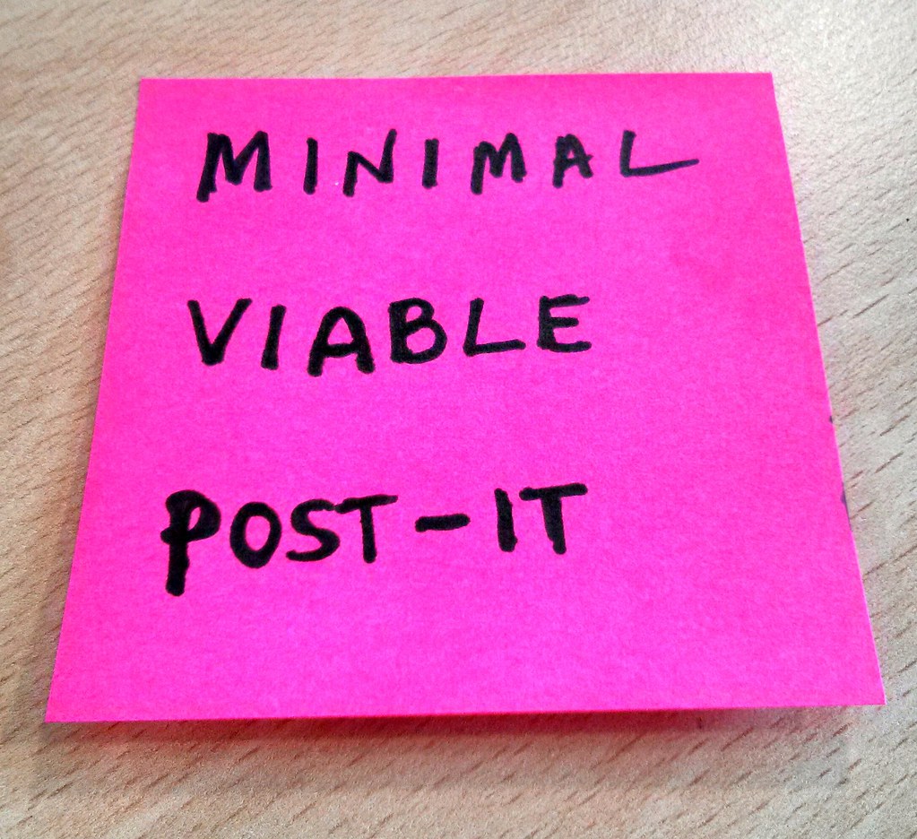
 Clearly displays the appeal of a post-it, while also being a frustrating waste of time and paper
Build a Minimal you can be proud of, or introducing the MSP
MVPs, MVEs, MAPs, SLCs (Simple, Lovable, Complete; an actual thing) all define similar priorities. The user must be pleased first, the owner next, with the team complying with the circumstances to provide something which is not the worst. Or whatever is the business definition of “AWESOME”.
At times, it’s fun for everyone. It feels a bit like a hack-a-thon and a personal challenge, trying to cram as much quality as possible within constraints specifically set to deter from quality (although every product and account manager will have their own philosophy on this), but it does grow weary, and fast.
Output under significant constraints will be constrained. It might be good, even as good as possible, but never as good as without that significant constraint.
In fact, when you intentionally cut down on the time and effort spent, you are getting a result that will have “holes” to fill. Might be documentation, shaky architecture or odd UI, but you’ll have a lot of negative effort that needs to be paid back for the result to get even with your expectations.
But what if the developers built the solution using a great, free, embedded QA tool?
A Minimal Shameless Product, at its core, is defined as something that will not trigger the quality control of a developer’s pride:
The Minimum Shameless Product is the smallest attainable target which can be presented to a user or group of users while not carrying forward an amount of “negative effort” that the development team feels will be impossible to pay back going forward.
This is not for the weak of heart. It empowers developers to negotiate slightly longer paths to delivery in exchange for lighter technical debt and heightened satisfaction, which they will pass on to the managers, owners and users. It’s a non-trivial reversal in the cycle of trust that requires all sides to cooperate.
But if that cycle is put in place, then instead of forcing everyone to accept a barely satisfactory solution, a product that the team will like, even love to work on, will be born. And if the team likes the working on the product, there is a greater than zero chance it’s Lovable, Awesome or whatever your buzzword is when you’re reading this.
So,
Release often, Release early, Listen to your users and to your developers.
Release shamelessly.
Never miss an essay!
If you find software development, design, systems thinking and management interesting - just drop your email into the box below. We write content roughly every other week, we won't share your mail with anyone, and we certainly won't spam you.
...and you're done! Thank you so much!
